ARC Music Festival Rebrand
Rebrand Project
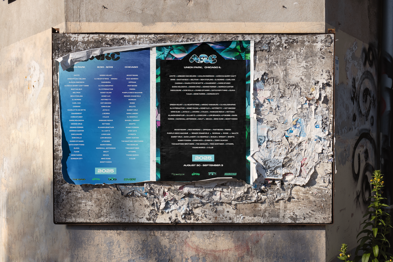
The ARC Music Festival is a three-day celebration of electronic music held in Chicago’s Union Park over Labor Day Weekend 2025. This rebrand aims to visually capture the energy, movement, and emotional intensity the festival ignites—channeling the essence of sound, lighting, and feeling into a bold new identity.
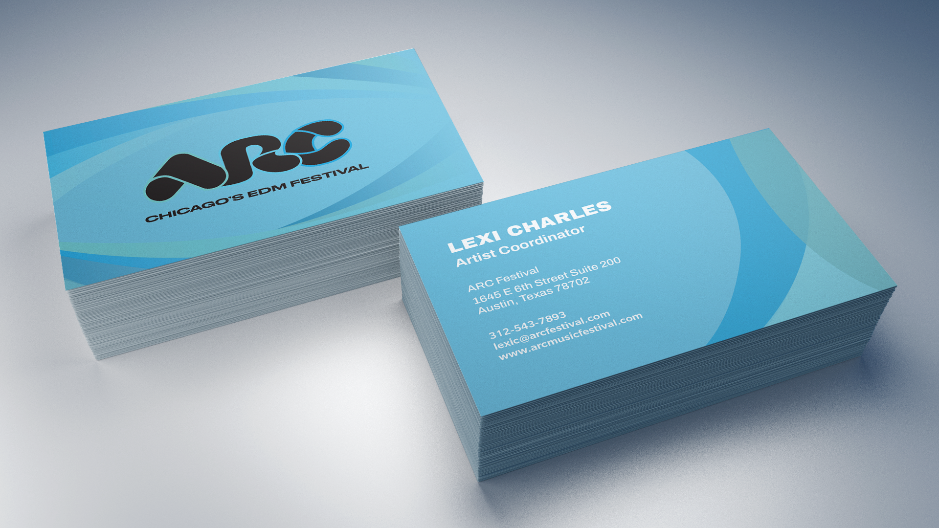
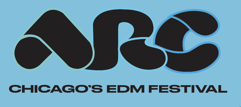
At the core of the rebrand is a custom wordmark developed through type design and exploration. Starting with the letter "A," the form evolved into a dynamic mark that echoes the experience of music and light cutting through darkness—mirroring the vibrant visuals and atmosphere of ARC. A bright, high-energy color palette reflects the electric lights, screen projections, and expressive fashion seen throughout the festival, while abstract letterforms and loud imagery speak to the immersive and sensory nature of the event. The result is a visual identity that embodies the pulse of ARC and the spirit of those who live for its sound.
Illustrator
Indesign
Figma
Photoshop
Tools:

Current
Redesign

Color Palette
#70cbcd

#5dcae7

#1baae2
#000000

Protoypes